Excel 차트 범례의 항목 순서를 어떻게 반대로 바꾸나요?
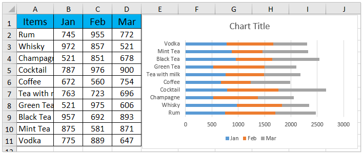
복잡한 데이터 세트를 다룰 때 Excel 을 통해 차트로 정보를 시각화하는 것은 일반적인 방법이며 데이터 패턴을 효과적으로 전달하는 데 도움이 됩니다. 예를 들어, 월별 판매 데이터를 나열한 판매 테이블이 있고, 아래 스크린샷과 같이 스택된 막대 차트을 만들어 이 정보를 시각화했다고 가정해 보겠습니다. 기본적으로 Excel 은 데이터의 첫 번째 항목(예: 1 월 판매량)부터 시작하여 그 다음 2 월, 그 이후 순으로 범례를 표시하며, 이는 일반적으로 데이터의 시간 순서와 일치합니다. 그러나 특정 보고 요구사항이나 더 나은 시각적 비교를 위해 이 순서를 반대로 바꿔야 할 수도 있습니다. 예를 들어 차트와 범례 모두에서 3 월을 처음으로, 1 월을 마지막으로 나열하는 경우입니다. 차트 범례의 항목 순서를 반대로 바꾸는 방법을 이해하면 특정 요구사항이나 프레젠테이션 선호도에 맞춰 보고서를 조정할 수 있습니다. 이 자습서에서는 Excel 에서 스택된 막대 차트의 범례 항목 순서를 반대로 바꾸는 자세한 단계별 지침을 제공합니다。
Excel 차트 범례의 항목 순서 반대로 바꾸기
Excel 에서 직접 스택된 막대 차트의 범례 항목 표시 순서를 반대로 바꾸려는 경우, 데이터 계열의 배열을 관리하여 이를 수행할 수 있습니다。 범례 순서를 변경하면 보고서의 우선순위에 맞추거나 다른 비즈니스 문서와 일관성을 유지하는 데 도움이 됩니다。 다음은 범례 항목을 수동으로 재배열하는 방법입니다 위에서 아래로:
1。 차트의 아무 위치나 마우스 오른쪽 버튼으로 클릭하고 상황에 맞는 메뉴에서Select Data을 선택하세요。 그러면 모든 차트 계열이 나열된 데이터 선택 소스 대화 상자가 열립니다。
2。 대화 상자에서Legend Entries (Series)섹션에 집중하세요。 첫 번째 범례 항목(예:1 월)을 클릭하여 강조 표시한 다음Move Down 버튼을 사용하여![]() 계열 목록의 맨 아래로 이동시키세요。
계열 목록의 맨 아래로 이동시키세요。
3。 필요에 따라 이 과정을 반복하세요。 나머지 각 계열을 아래로 이동시켜 원래 마지막에 있던 계열이 목록 맨 위에 오도록 하세요。 여기에서 계열 순서를 바꾸면 범례 위치가 즉시 업데이트됩니다。 완료되면OK을 클릭하여 대화 상자를 확인하고 닫으세요。
워크시트로 돌아오면 차트 범례가 이제 항목을 역순으로 표시하는 것을 확인할 수 있습니다。
팁:
- 차트에 여러 개의 계열이 포함된 경우, 재정렬 중 혼동을 방지하기 위해 계열 레이블을 잘 추적하세요。 변경 전 초기 순서를 기록해 두는 것을 고려해 보세요。
- 나중에 계열을 추가하거나 제거할 경우 수동으로 재배열할 때 세심한 주의가 필요합니다。 변경 후 범례 순서를 확인하여 의도한 대로 유지되는지 확인하세요。
- 차트가 동적 범위에 연결되어 있거나 정기적으로 업데이트되는 경우, 원본 데이터을 업데이트한 후 이 과정을 반복해야 할 수도 있습니다。
문제 해결:
- 위로 이동/아래로 이동 버튼을 사용할 수 없거나 비활성화된 경우, 버튼을 사용하기 전 목록에서 직접 시리즈 이름을 클릭해 보세요。
- 변경 내용이 차트에 반영되지 않으면 파일을 닫고 다시 열거나 F9 키를 눌러 새로 고침하세요。
관련 문서:
최고의 Office 생산성 도구
| 🤖 | KUTOOLS AI 도우미: 다음을 기반으로 데이터 분석 혁신하기:지능형 실행 | 코드 생성| 사용자 지정 수식 생성 | 데이터 분석 및 차트 생성| 향상된 함수 호출… |
| 인기 기능:찾기, 강조 표시 또는 중복 표시 | 빈 행 삭제 | 데이터 손실 없이 열 결합 또는 셀 제거 | 공식을 사용하지 않는 반올림... | |
| 슈퍼 LOOKUP:다중 조건 VLookup | 다중 값 VLookup | 여러 시트에서 VLookup | 퍼지 매치.... | |
| 고급 드롭다운 목록:드롭다운 목록 빠르게 생성 | 종속형 드롭다운 목록 | 다중 선택 드롭다운 목록.... | |
| 열 관리자:특정 수의 열 추가|열 이동|숨겨진 열의 표시 상태 전환|범위 및 열 비교... | |
| 주요 기능:그리드 포커스 | 디자인 보기 |향상된 수식 표시줄 | 워크북 및 시트 관리자 | 자원 라이브러리(자동 텍스트)| 날짜 선택기 | 워크시트 병합 | 암호화/셀 해독 | 목록으로 이메일 보내기 | 슈퍼 필터 | 특수 필터(굵은 글꼴이 있는 셀 필터링/기울임꼴/취소선。。。) 。。。 | |
| 상위 15 도구 모음:12 텍스트도구(텍스트 추가,특정 문자 삭제, ...)| 50+차트유형(간트 차트, ...)| 40+ 실용적인수식(생일을 기준으로 나이 계산, ...)| 19 삽입도구(QR 코드 삽입,경로에서 그림 삽입, ...)| 12 변환도구(단어로 변환하기,환율 변환, ...)| 7 병합 및 분할도구(고급 행 병합,셀 분할, ...)|그 외 더 많은 기능 |
Kutools for Excel 로 Excel 역량을 한 단계 업그레이드하고 전례 없는 효율성을 경험하세요。Kutools for Excel 는 생산성과 저장 시간을 향상시키는 300 개 이상의 고급 기능을 제공합니다。가장 필요한 기능을 지금 바로 확인하세요。。。
Office Tab 가 Office 에 탭 인터페이스를 제공하여 작업을 훨씬 쉽게 만들어 줍니다
- Word, Excel, PowerPoint 에서 탭 기반 편집 및 읽기 기능을 활성화합니다, Publisher, Access, Visio 및 Project 에서도 사용 가능합니다。
- 새 창이 아닌 동일한 창의 새 탭에서 여러 문서를 열고 생성할 수 있습니다。
- 50% 만큼 생산성을 높이고 매일 수백 번의 마우스 클릭을 줄여줍니다!
모든 Kutools 애드인。 하나의 설치 프로그램
Kutools for Office스위트 번들은 Excel, Word, Outlook 및 PowerPoint 용 애드인과 Office Tab Pro 를 포함하며, 다양한 Office 앱을 사용하는 팀에 이상적입니다。
- 올인원 스위트— Excel, Word, Outlook 및 PowerPoint 애드인 + Office Tab Pro
- 하나의 설치 프로그램, 하나의 라이선스— 몇 분 안에 설정 완료(MSI 지원)
- 함께 사용할수록 더 효과적입니다— Office 앱 전반에서 생산성 향상
- 30 일간 모든 기능 무료 체험— 등록이나 신용카드 필요 없음
- 최고의 가성비— 개별 애드인 구매 대비 절약