엑셀에서 X축에 날짜와 시간을 포함한 차트를 만드는 방법은 무엇입니까?
엑셀에서는 데이터를 더 잘 설명하기 위해 차트를 삽입하는 경우가 많습니다. 하지만 특정 상황에서는 날짜와 시간의 데이터를 기반으로 열/막대/선 차트를 생성할 때, 차트의 X축이 아래 스크린샷과 같이 표시될 수 있습니다. 이 문서에서는 차트의 X축에 날짜와 시간을 올바르게 표시하는 방법을 소개합니다.

 X축에 날짜와 시간을 정확히 표시하는 차트 만들기
날짜와 시간을 올바르게 표시하려면 서식 축 대화상자에서 한 가지 옵션만 변경하면 됩니다.
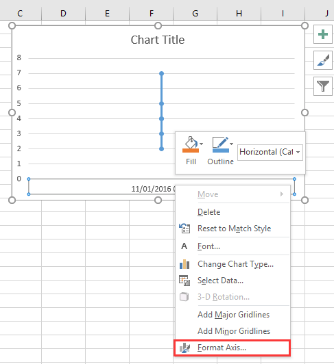
1. 차트의 X축을 마우스 오른쪽 버튼으로 클릭하고 서식 축 을 컨텍스트 메뉴에서 선택하세요. 스크린샷 보기:
2. 그런 다음 서식 축 창 또는 서식 축 대화상자에서 축 옵션 탭 아래에서 텍스트 축 옵션을 체크하세요. 위치는 축 유형 섹션에 있습니다. 스크린샷 보기:
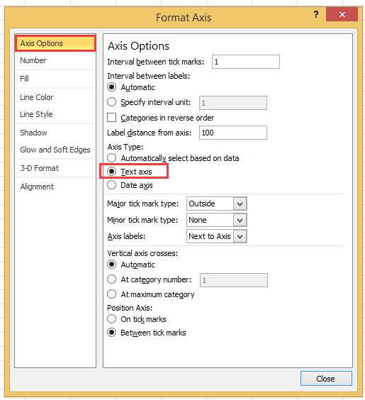
2010 이후 버전의 엑셀을 사용 중이라면 서식 축 창이 나타나며, 축 옵션 그룹 내 축 유형에서 텍스트 축 옵션을 체크할 수 있습니다.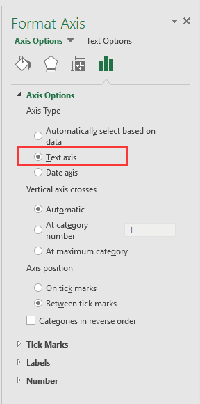
3. 닫기 를 클릭하거나 차트로 돌아가면 날짜와 시간 데이터가 X축에 올바르게 표시됩니다. 스크린샷 보기:

두 단계로 속도계 차트 만들기! |
| 프로젝트 진행 상황을 속도계 차트로 표시하려는 경우, 엑셀에서 이를 생성하는 것은 복잡하고 시간이 많이 소요될 수 있습니다. Kutools for Excel의 속도계 차트 도구는 이 과정을 간소화하여 두 가지 간단한 단계로 전문적인 속도계 차트를 생성할 수 있도록 합니다. 지금 다운로드!. |
 |
최고의 오피스 생산성 도구
| 🤖 | Kutools AI 도우미: 데이터 분석에 혁신을 가져옵니다. 방법: 지능형 실행 | 코드 생성 | 사용자 정의 수식 생성 | 데이터 분석 및 차트 생성 | Kutools Functions 호출… |
| 인기 기능: 중복 찾기, 강조 또는 중복 표시 | 빈 행 삭제 | 데이터 손실 없이 열 또는 셀 병합 | 반올림(수식 없이) ... | |
| 슈퍼 LOOKUP: 다중 조건 VLOOKUP | 다중 값 VLOOKUP | 다중 시트 조회 | 퍼지 매치 .... | |
| 고급 드롭다운 목록: 드롭다운 목록 빠르게 생성 | 종속 드롭다운 목록 | 다중 선택 드롭다운 목록 .... | |
| 열 관리자: 지정한 수의 열 추가 | 열 이동 | 숨겨진 열의 표시 상태 전환 | 범위 및 열 비교 ... | |
| 추천 기능: 그리드 포커스 | 디자인 보기 | 향상된 수식 표시줄 | 통합 문서 & 시트 관리자 | 자동 텍스트 라이브러리 | 날짜 선택기 | 데이터 병합 | 셀 암호화/해독 | 목록으로 이메일 보내기 | 슈퍼 필터 | 특수 필터(굵게/이탤릭/취소선 필터 등) ... | |
| 15대 주요 도구 세트: 12 가지 텍스트 도구(텍스트 추가, 특정 문자 삭제, ...) | 50+ 종류의 차트(간트 차트, ...) | 40+ 실용적 수식(생일을 기반으로 나이 계산, ...) | 19 가지 삽입 도구(QR 코드 삽입, 경로에서 그림 삽입, ...) | 12 가지 변환 도구(단어로 변환하기, 통화 변환, ...) | 7 가지 병합 & 분할 도구(고급 행 병합, 셀 분할, ...) | ... 등 다양 |
Kutools for Excel과 함께 엑셀 능력을 한 단계 끌어 올리고, 이전에 없던 효율성을 경험하세요. Kutools for Excel은300개 이상의 고급 기능으로 생산성을 높이고 저장 시간을 단축합니다. 가장 필요한 기능을 바로 확인하려면 여기를 클릭하세요...
Office Tab은 Office에 탭 인터페이스를 제공하여 작업을 더욱 간편하게 만듭니다
- Word, Excel, PowerPoint에서 탭 편집 및 읽기를 활성화합니다.
- 새 창 대신 같은 창의 새로운 탭에서 여러 파일을 열고 생성할 수 있습니다.
- 생산성이50% 증가하며, 매일 수백 번의 마우스 클릭을 줄여줍니다!
모든 Kutools 추가 기능. 한 번에 설치
Kutools for Office 제품군은 Excel, Word, Outlook, PowerPoint용 추가 기능과 Office Tab Pro를 한 번에 제공하여 Office 앱을 활용하는 팀에 최적입니다.
- 올인원 제품군 — Excel, Word, Outlook, PowerPoint 추가 기능 + Office Tab Pro
- 설치 한 번, 라이선스 한 번 — 몇 분 만에 손쉽게 설정(MSI 지원)
- 함께 사용할 때 더욱 효율적 — Office 앱 간 생산성 향상
- 30일 모든 기능 사용 가능 — 회원가입/카드 불필요
- 최고의 가성비 — 개별 추가 기능 구매 대비 절약