Excel 차트에서 0 데이터 레이블을 숨기는 방법은 무엇입니까?
Excel에서 차트를 생성할 때, 데이터 레이블을 추가하면 데이터 포인트를 명확히 하고 사용자에게 값에 대한 직접적인 접근을 제공하는 데 도움이 됩니다. 그러나 차트의 데이터에 0이 포함된 경우 Excel에서는 종종 이러한 0을 데이터 레이블로 표시하여 혼동을 일으키거나 차트의 시각적 매력을 감소시킬 수 있습니다. 많은 비즈니스, 학술 또는 보고 상황에서, 의미 있는 값만 차트에 표시하기 위해 이러한 0 데이터 레이블을 숨기는 것이 일반적입니다.
다행히도 Excel은 다양한 실용적인 방법을 제공하여 0 데이터 레이블을 숨길 수 있으며, 각 방법은 다른 필요와 작업 흐름에 적합합니다. 이 튜토리얼에서는 내장 형식 지정, 수식 기반 방법 및 VBA를 통한 자동화를 포함한 인기 있는 접근법을 요약했습니다. 단계별 지침과 유용한 팁을 통해 차트가 중요한 데이터만 표시하도록 만드는 방법을 알아보세요.
사용자 정의 숫자 형식을 통한 차트에서 0 데이터 레이블 숨기기
차트의 0 데이터 레이블을 원본 데이터를 수정하지 않고 숨기려면, 가장 빠른 방법 중 하나는 데이터 레이블에 사용자 정의 숫자 형식을 적용하는 것입니다. 이 방법은 기본 데이터(0 포함)를 유지하면서 차트에서 0 값을 표시하지 않으려는 경우 특히 유용합니다.
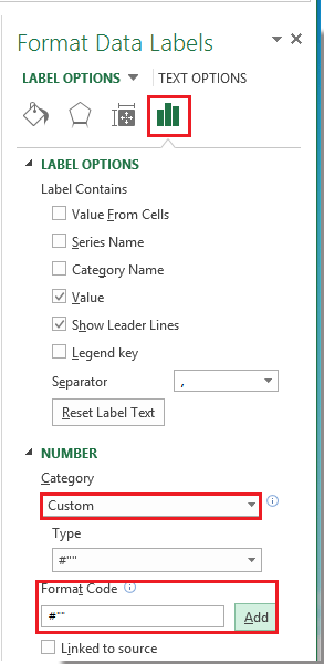
먼저, 필요에 따라 차트에 데이터 레이블을 추가합니다. 그런 다음, 데이터 레이블 중 하나를 마우스 오른쪽 버튼으로 클릭하고 컨텍스트 메뉴에서 데이터 레이블 서식을 선택합니다. 스크린샷 참조:

데이터 레이블 서식 대화 상자에서 왼쪽 창에서 숫자를 클릭합니다. 그런 다음, 범주 목록 상자에서 사용자 정의를 선택합니다. 형식 코드 텍스트 상자에 #"" 형식 코드를 입력하고, 추가를 클릭하여 형식 목록에 저장합니다. 스크린샷 참조:

참고: Excel 2013 이상에서는, 데이터 레이블 중 하나를 마우스 오른쪽 버튼으로 클릭하고 데이터 레이블 서식을 선택한 후, 서식 창에서 숫자를 확장하고, 사용자 정의를 선택하고, #"" 형식 코드를 입력하고, 추가를 클릭합니다.
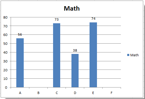
대화 상자를 닫으려면 닫기를 클릭하세요. 이제 값이 0인 모든 데이터 레이블은 차트 표시에서 숨겨지고 0이 아닌 값만 남게 됩니다.
팁: 0 데이터 레이블을 복원하려면 데이터 레이블 서식 대화 상자로 돌아가서 숫자 > 사용자 정의를 선택하고 형식 목록에서 #,##0;-#,##0 같은 표준 숫자 형식을 선택하세요.
이 솔루션은 빠른 시각적 수정을 원할 때 특히 효과적이며 대부분의 숫자 기반 차트(예: 열, 막대, 선 등)에 적용됩니다. 그러나 데이터 소스가 수식이나 변경되는 0 값으로 정기적으로 업데이트되는 경우 아래의 수식 기반 또는 자동화된 솔루션을 고려해야 합니다.
주의: 사용자 정의 숫자 형식은 차트에서 0을 시각적으로 숨기지만 실제 값은 백그라운드와 소스 데이터에서 여전히 0입니다.
Excel 수식 - 원본 데이터의 IF 수식을 사용하여 차트에서 0 숨기기
Excel 차트에 0 데이터 레이블이 나타나지 않도록 하는 또 다른 실용적인 방법은 IF 수식을 사용하여 소스 데이터를 수정하는 것입니다. 이 방법은 차트 데이터 범위의 0 값을 빈 셀로 바꾸어 Excel의 차트 엔진이 이러한 점들을 플롯하거나 레이블링하지 않도록 합니다. 이 접근 방식은 차트가 동적 데이터 범위 또는 수식을 참조하는 경우에 특히 유용하며, 추가 서식 없이 표시할 데이터를 제어하려는 경우에 적합합니다.
적용 가능한 시나리오: 소스 데이터를 조작할 수 있거나(또는 차트용 보조 열을 만들 수 있을 때) 차트 레이블 또는 차트 시리즈 자체에서 0 값을 완전히 제외하려는 경우 이 솔루션을 사용하세요.
장점: 간단하고 효과적이며, 0이 차트의 데이터 포인트와 레이블 모두에서 생략되도록 보장합니다.
단점: 기존 데이터를 조정하거나 원래 데이터 세트를 변경하지 않으려는 경우 보조 열을 추가해야 할 수 있습니다.
이 솔루션을 구현하려면:
새로운 보조 열 또는 기존 데이터 범위(예: 원래 값이 B2 셀부터 시작한다고 가정)에 다음 수식을 해당 셀(예: C2 셀)에 입력합니다:
=IF(A1=0,"",A1)이 수식은 C2 셀을 확인합니다: 값이 0이면 빈 셀을 반환하고, 그렇지 않으면 원래 값을 반환합니다.
수식을 확인하려면 Enter를 누릅니다. 그런 다음, 필요한 경우 수식을 기존 데이터와 함께 복사합니다. 수식 셀을 선택하고 채우기 핸들을 드래그하거나 Ctrl+C/Ctrl+V를 사용합니다.
3. 차트의 데이터 범위를 새 보조 열(예: C 열)을 참조하도록 업데이트하여 플롯된 시리즈가 조정된 값을 반영하도록 합니다.
- 차트의 기존 데이터 레이블 중 하나를 마우스 오른쪽 버튼으로 클릭하고 "데이터 레이블 서식"을 선택합니다.
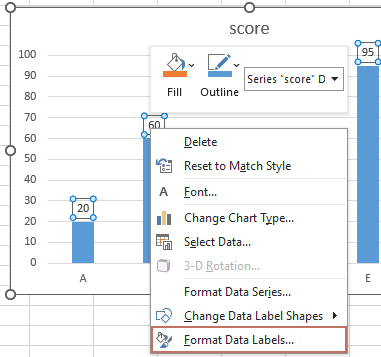
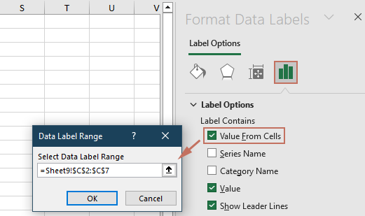
- 레이블 옵션에서 "셀로부터 값"을 선택합니다. 그런 다음 대화 상자가 나타납니다. 보조 열의 범위를 선택하고 확인을 클릭합니다.
- "값"과 같은 다른 레이블 옵션을 선택 해제합니다.


이제 Excel은 차트 데이터 범위의 셀이 진짜로 비어있기 때문에(0이 아님) 0 값에 대한 데이터 레이블을 표시하지 않습니다. 참고로, 차트 설정에서 공백이 0으로 해석되지 않도록 확인하세요(예: 선형 또는 산점 차트에서 "숨겨진 셀 및 비어있는 셀 설정"을 확인).
오류 알림: 수식 열에 #VALUE!와 같은 오류가 있는 셀이 포함된 경우, 해당 포인트는 차트에서 생략되거나 오류 레이블이 표시될 수 있습니다. 모든 행에서 수식이 작동하는지 확인하세요.
VBA 코드 - 차트에서 0 데이터 레이블 자동으로 숨기기
대규모 데이터 세트, 자주 업데이트되는 차트 또는 반복 보고서의 경우, VBA 사용은 Excel 차트에서 0 데이터 레이블을 자동으로 숨기거나 제거하는 편리하고 효율적인 방법을 제공합니다. VBA 솔루션은 프로세스를 자동화하거나 여러 차트를 한 번에 처리하려는 경우 수동 서식 없이 적합합니다.
적용 가능한 시나리오: 이 접근 방식은 매크로 실행에 익숙한 사용자 또는 여러 Excel 워크북에서 복잡하고 반복적인 차트 작업을 관리하는 경우에 가장 적합합니다.
장점: 0 데이터 레이블 숨김을 자동화하여 시간을 절약하고 수동 오류의 가능성을 줄입니다. 데이터 변경 시 또는 자주 업데이트되는 대시보드를 생성하는 경우에도 작동합니다.
단점: 매크로를 활성화하고, 기본적인 VBA 절차를 이해해야 합니다. 데이터 또는 차트 시리즈가 실행 이후에 업데이트되면 VBA로 변경된 내용을 새로 고쳐야 할 수 있습니다.
이 VBA 솔루션을 사용하는 방법:
1. Excel 리본에서 개발 도구 > Visual Basic을 클릭하여 VBA 에디터를 엽니다. VBA 창에서 삽입 > 모듈을 클릭하고 새로 생성된 모듈에 다음 코드를 붙여넣습니다.
Sub HideZeroDataLabels()
'Updated by extendoffice 2025/7/11
    Dim cht As Chart
    Dim s As Series
    Dim pt As Point
    Dim xTitleId As String

    On Error Resume Next
    xTitleId = "KutoolsforExcel"

    Set cht = Application.ActiveChart
    If cht Is Nothing Then
        MsgBox "Please activate the chart from which you want to hide zero data labels.", vbExclamation, xTitleId
        Exit Sub
    End If

    For Each s In cht.SeriesCollection
        For Each pt In s.Points
            If pt.HasDataLabel Then
                If pt.DataLabel.Text = "0" Or pt.DataLabel.Text = "0%" Then
                    pt.DataLabel.Delete
                End If
            End If
        Next pt
    Next s
End Sub
작업표로 돌아가서 0 데이터 레이블을 숨기고 싶은 차트를 활성화합니다(차트 테두리를 한 번 클릭하세요).
3VBA 에디터로 돌아가서 ![]() 실행 버튼을 클릭하거나 F5를 눌러 매크로를 실행합니다. 매크로는 모든 차트 시리즈를 순환하며 0 값의 레이블을 자동으로 숨기고 다른 데이터 레이블은 그대로 유지합니다.
실행 버튼을 클릭하거나 F5를 눌러 매크로를 실행합니다. 매크로는 모든 차트 시리즈를 순환하며 0 값의 레이블을 자동으로 숨기고 다른 데이터 레이블은 그대로 유지합니다.
실용적인 팁: 차트에 두 개 이상의 데이터 시리즈가 포함된 경우 매크로는 각 시리즈를 개별적으로 처리합니다. 또한 더 쉬운 반복 사용을 위해 매크로를 사용자 정의 버튼에 할당할 수도 있습니다.
오류 알림: 코드를 실행하기 전에 매크로를 활성화했는지 확인하고, 처리하려는 차트가 현재 활성 상태인지 확인하세요. 그렇지 않으면 경고 메시지가 표시됩니다.
관련 기사:
최고의 오피스 생산성 도구
| 🤖 | Kutools AI 도우미: 데이터 분석에 혁신을 가져옵니다. 방법: 지능형 실행 | 코드 생성 | 사용자 정의 수식 생성 | 데이터 분석 및 차트 생성 | Kutools Functions 호출… |
| 인기 기능: 중복 찾기, 강조 또는 중복 표시 | 빈 행 삭제 | 데이터 손실 없이 열 또는 셀 병합 | 반올림(수식 없이) ... | |
| 슈퍼 LOOKUP: 다중 조건 VLOOKUP | 다중 값 VLOOKUP | 다중 시트 조회 | 퍼지 매치 .... | |
| 고급 드롭다운 목록: 드롭다운 목록 빠르게 생성 | 종속 드롭다운 목록 | 다중 선택 드롭다운 목록 .... | |
| 열 관리자: 지정한 수의 열 추가 | 열 이동 | 숨겨진 열의 표시 상태 전환 | 범위 및 열 비교 ... | |
| 추천 기능: 그리드 포커스 | 디자인 보기 | 향상된 수식 표시줄 | 통합 문서 & 시트 관리자 | 자동 텍스트 라이브러리 | 날짜 선택기 | 데이터 병합 | 셀 암호화/해독 | 목록으로 이메일 보내기 | 슈퍼 필터 | 특수 필터(굵게/이탤릭/취소선 필터 등) ... | |
| 15대 주요 도구 세트: 12 가지 텍스트 도구(텍스트 추가, 특정 문자 삭제, ...) | 50+ 종류의 차트(간트 차트, ...) | 40+ 실용적 수식(생일을 기반으로 나이 계산, ...) | 19 가지 삽입 도구(QR 코드 삽입, 경로에서 그림 삽입, ...) | 12 가지 변환 도구(단어로 변환하기, 통화 변환, ...) | 7 가지 병합 & 분할 도구(고급 행 병합, 셀 분할, ...) | ... 등 다양 |
Kutools for Excel과 함께 엑셀 능력을 한 단계 끌어 올리고, 이전에 없던 효율성을 경험하세요. Kutools for Excel은300개 이상의 고급 기능으로 생산성을 높이고 저장 시간을 단축합니다. 가장 필요한 기능을 바로 확인하려면 여기를 클릭하세요...
Office Tab은 Office에 탭 인터페이스를 제공하여 작업을 더욱 간편하게 만듭니다
- Word, Excel, PowerPoint에서 탭 편집 및 읽기를 활성화합니다.
- 새 창 대신 같은 창의 새로운 탭에서 여러 파일을 열고 생성할 수 있습니다.
- 생산성이50% 증가하며, 매일 수백 번의 마우스 클릭을 줄여줍니다!
모든 Kutools 추가 기능. 한 번에 설치
Kutools for Office 제품군은 Excel, Word, Outlook, PowerPoint용 추가 기능과 Office Tab Pro를 한 번에 제공하여 Office 앱을 활용하는 팀에 최적입니다.
- 올인원 제품군 — Excel, Word, Outlook, PowerPoint 추가 기능 + Office Tab Pro
- 설치 한 번, 라이선스 한 번 — 몇 분 만에 손쉽게 설정(MSI 지원)
- 함께 사용할 때 더욱 효율적 — Office 앱 간 생산성 향상
- 30일 모든 기능 사용 가능 — 회원가입/카드 불필요
- 최고의 가성비 — 개별 추가 기능 구매 대비 절약